Humans brand everything, including space travel.
You better put your seatbelt on. Today, we are going to talk about the history behind the National Aeronautics and Space Administration (NASA) logos. It is one of the organization logos that anyone could pick out from a crowded place. You have most likely seen it in movies, textbooks, behemoth fashion brands, and even Walmart.
Space geeks, fashion icons, and designers all celebrate the logo of the agency that brought humankind to the moon and back. This article will cover all the bases from the meatball logo to the official seal.
NASA has achieved a lot of praise-worthy things. From the Mars Exploration Rovers to their branding strategy, their work is worth taking note of. One mystery that may come to some is the reason why the agency’s emblem is widely loved.
A marketing professor named Utpal Dholakia from Rice University weighed in on this. Dholakia stated in an LA Times interview that the brand has a broad appeal, all while having no characteristics to dislike. Only a small amount of brands have this kind of effect on consumers. But apart from solid brand building, this brand mark has more to its looks.
We can dive deeper into what makes this design so appealing and how it came to be. Let’s learn more about it below:
Meet the designers
The basic reflex of any designer upon seeing an iconic design is to learn who designed it. Besides, people are just naturally drawn to learning fun facts about pop culture. Whatever drives your curiosity, this section will help quench that with knowledge.
James Modarelli
The Meatball was designed by an employee named James Modarelli during NASA’s second year. Modarelli got his degree from the Cleveland Institute of Art. He pursued a career as an artist-designer in a laboratory that NASA would soon absorb into its operations.
His meatball masterpiece was a result of the agency tasking him to create a more appropriate graphic mark for daily use. Modarelli modeled the symbol after a radical supersonic aircraft that he saw during an Ames Unitary Plan Wind Tunnel Tour in 1958. The artist-designer tweaked the airplane’s configurations to create the symbol, explaining the wing in the design.
Modarelli became an inductee of the Glenn Research Center Hall of Fame in 2015.
Danne & Blackburn
In 1975, the agency introduced another logo. NASA came out with a more updated and modern logo. The firm Danne & Blackburn was responsible for this design. The firm has also worked with companies such as Harvard Business School, Du Pont, AT&T, Pratt & Whitney, and more.
Danne & Blackburn introduced a logotype that looked lightyears away from its meatball counterpart. Business partners Richard Danne and Bruce Blackburn put in hours upon hours of research and development for this fluid logo. They pitched this clean and modern logo with a 35mm presentation. The firm aimed to pitch something to the agency that could be seen even from afar, which is something that the meatball lacked.
In a talk hosted by COLLINS, Danne shared an anecdote from his firm’s presentation. He faced the reluctance of NASA Administrator Dr. James Fletcher. The administrator said, “I just don’t feel like we aren’t getting our money’s worth!” upon seeing the worm-like typography without the cross stroke of the letter A. But at the end of the day, they bagged the project. The firm also received a presidential award for design excellence.
Meanings
Different logo versions help create a more precise branding strategy. It is common, especially for huge companies, to have more than just one logo. This includes brands like NBA teams, Adidas, Virgin, and many more. They have set identities for different functions like NASA.
The agency has three well-known logos, and we are going to talk about the meaning behind each one.
The Meatball
Considered as the “everyday face” of NASA, this blue brand mark is easily the most recognizable of the three. You can see this mark on the agency’s architecture, website, and other assets.
The star logo features elements that each carry a different meaning. Its blue-colored circle alludes to planets, and the stars help symbolize outer space. The line that appears to loop around the agency’s wordmark is space travel. In contrast, the red chevron wing adds a striking and patriotic detail.
The Worm
US President Ronald Raegan recognized the attention-grabbing typography in 1984 for its innovation and simplicity. This design makes clever use of the innate attraction humans have to curvy figures instead of angular ones.
The distinct composition of this mark communicates more significant innovation. It was also much easier to apply to different materials the agency needed. This includes spacesuits, vans, trucks, and rocket ships, among many others.
Additionally, The Worm and the Meatball are never used at the same time for a single material. At the moment, this logo is not assigned to any particular application. The Meatball is still NASA’s primary insignia. However, the worm is on The SpaceX Falcon 9 rocket, the agency’s partially reusable launch vehicle.
The Seal
Check out this dressed-up version of the meatball.
People see it used for various formal occasions within the agency, such as awards, ceremonies, and more. Overall, it does not look too far off of the meatball logo. It still has graphic elements alluding to space travel and that signature red chevron detail. The Seal looks more formal with its stamp-like frame that holds that unabbreviated version of NASA’s name.
Special Edition Logos
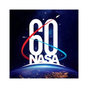
NASA commemorates significant events like its 60th anniversary as a government agency with a dedicated logo. Additionally, their missions also have their dedicated symbols called mission patches. Projects like the Earth Observing System, Spacelab Life Science, Magellan, and more have a badge that represents their objectives.
The Timeline
The establishment of the agency in 1958 paved the way for three great logos. How and when they got each one is worth the read. Below is the timeline of NASA’s logo history.
1959
Inspired by the NASA official seal, Modarelli created this flat design for the agency. Interestingly, in aeronautics, the meatball is a landing system. It is a process done using a mirror to reflect a beam of light to a pilot from the ground. The pilot follows this “meatball” as a guide during the landing process. It has a deep meaning that goes swimmingly with the agency’s mission.
The artist-designer of NASA hit the nail on the head with this project. It remains unchanged to this day.
1975
The agency decided to get another logo. Not to replace, but to serve as a secondary logo. This was the year The Worm was introduced to the world. The Meatball was too complex for printing with the use of the technology available to many during the ‘70s.
The Worm was an adaptive logo to its heavily-detailed counterpart.
1992
After 17 years, the agency practically stopped using this curvy typography on projects aside from clothing and other souvenir items. There’s a lot of myth behind its discontinued use. One of which is that the employees couldn’t connect to this award-winning symbol as much as The Meatball logo.
The agency’s historian added that NASA administrator Daniel Goldin ordered its reinstatement. It was an effort done to help boost morale. The ‘90s was a challenging time for the agency because it was only a couple of years after the Hubble Space Telescope predicament happened.
What can we learn from this?
Connection is important.
NASA bringing back the blue symbol as its primary symbol shows that a symbol is more than just a stamp to brand your projects like a watermark. A good agency logo must be something that helps bind agencies and teams as well. Keep this in mind when you are sourcing a design for your own company.
2020
In April 2020, NASA proudly announced that The Worm is making a comeback. And a big one at that. It’s just in time for the Falcon 9 expedition. The agency said in a blog post, “it seems the worm logo wasn’t really retired. It was just resting up for the next chapter of space exploration.”
So now, we have three otherworldly symbols to associate with the space agency.
Conclusion
This space logo is definitely one to remember. Besides the agency’s contribution to science and humanity, they also give branding experts and designers something to learn from. This top-ranking agency is a force to be reckoned with in the field of space travel. NASA has grown to inspire many, even professionals and students.
Your brand can be this much of an influence in your field, too. With the right strategy and a branding kit to match, your company can experience supersonic growth. By using the space logo maker, you can make a symbol like The Meatball today.

