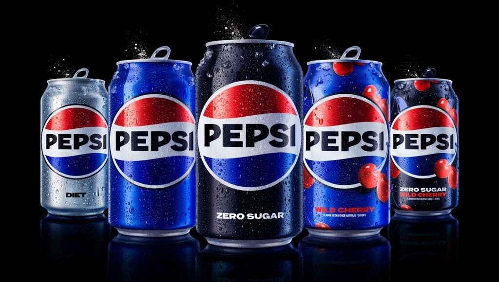
To celebrate its 125th anniversary, Pepsi launches, for the first time in 15 years, a brand-new logo and visual identity
With the new identity set to roll out in 2024, the logo and visual system are crafted with a futuristic vision. The logo continues to draw inspiration from the brand’s well-known logo featuring the red, white and blue globe, first introduced in 1987. The improved and contemporary design is much larger and more prominent with the ‘Pepsi’ wordmark adorning the centre of the logo.

An improved colour palette with more vibrant yet deeper hues delivers a striking visual of the dynamic logo against the electric blue can. Replacing the soft and rounded lowercase, the bespoke typography is striking with crisp edges portraying a sharper look. Pepsi’s rebrand will be seen across physical and digital platforms representing the brand’s identity of being unapologetically current.
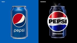
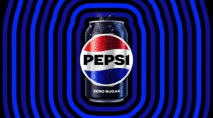
Pepsi’s fresh look draws from the brand’s heritage with a vision of the future and a focus on the brand’s digital visual identity.
“We designed the new brand identity to connect future generations with our brand’s heritage, marrying distinction from our history with contemporary elements to signal our bold vision for what’s to come.” Mauro Porcini, SVP & chief design officer of PepsiCo.
Here’s Pepsi’s evolution over the years indicating close ties to pop culture and a bold challenger mindset with a spirit of evolving with time.
For more information on Pepsi’s design, visit their website or follow them on Instagram.

