Are you a coffee lover or tea lover? Either way, you’ve most likely heard of Starbucks, one of the most popular coffeehouses worldwide.
Have you wondered about Starbucks logo evolution? It’s a pretty interesting one since it’s a mixture of mythology and looking back at their geographic roots.
Join us as we dive into Starbucks logo history and learn from their technique.
Starbucks Logo Meaning
Let’s get into the history of the logo. Understanding where the logo and business came from is a great way to learn how to do your business and grab attention through your brand identity.
Let’s get into Starbucks’ humble beginnings. They sold all sorts of coffee, teas, and spices worldwide in Seattle’s Pike Place Market.
Paying homage to the location, they created their logo and name. Their most striking visual is the siren as their mascot logo.
The hidden meaning of Starbucks’ logo is that it represents its connection with Pike Place Market. They wanted a logo associated with the sea and the fish sellers who put on a show tossing the fish and catching it before wrapping it up for the customer.
The iconic logo came into existence after creating the business’ name, Starbucks. It’s inspired by the book Moby Dick since they wanted to relate their visuals to their place of origin.
They found the siren by scouring through old marine books, according to Tyler Krivich, Starbucks Representative. The mythological creature depicted in Starbucks’ logo has wavy hair and is an homage to the ocean, the body of water that’s near Seattle.
Now that we know the background of the logo. Let’s look at the revisions of his mythological logo through the years.
Starbucks Logo Evolution
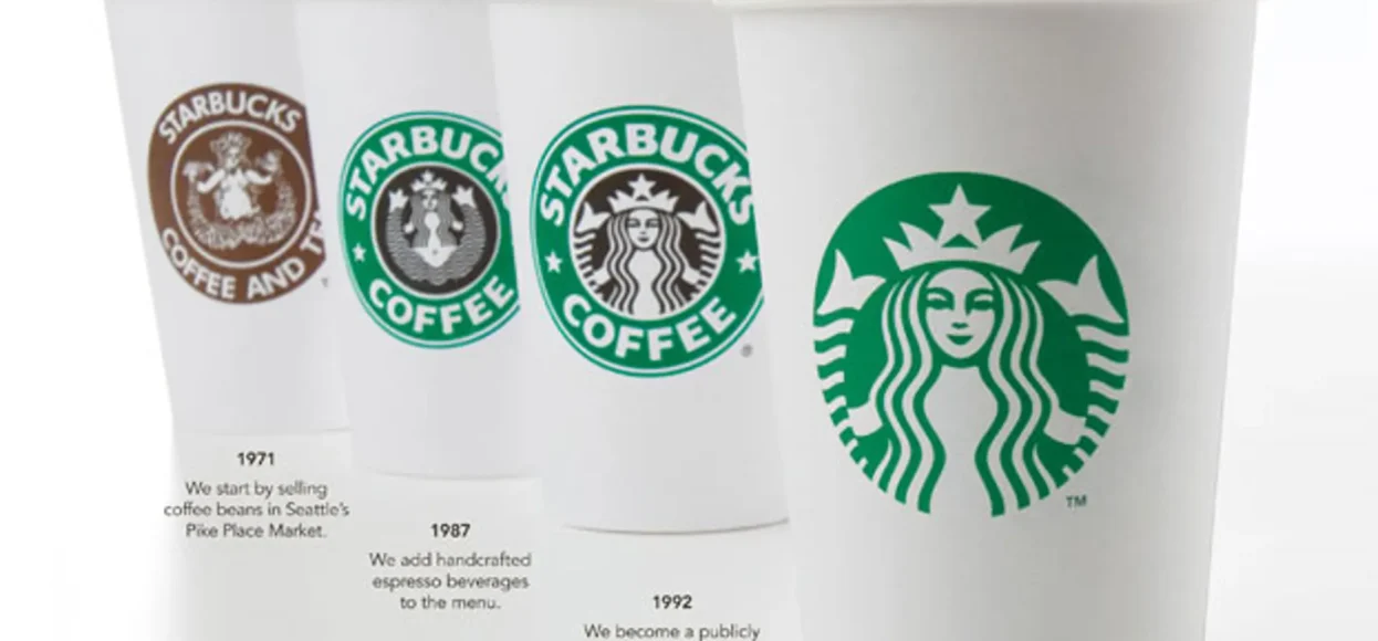
The logo has experienced five revisions since its creation in 1971 by Terry Heckler. Let’s look at them and learn from their mistakes and charm.
- 1971
- 1987
- 1992
- 2008
- 2011
1971
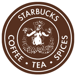
Before the Starbucks we know today, the business was called Starbucks, Coffee, Tea, and Spice. When Jerry Baldwin, Zev Siegl, and Gordon Bowker created the small business, they thought of a buffer zone.
A spot where people were doing their market errands could get their daily coffee dose. So the coffeehouse came to life. As mentioned above, Terry Heckler created the first logo for Starbucks.
He did extensive research and came up with the siren as the personification of the coffeehouse logo. It’s a symbol that lures people around the area to have a coffee at Starbucks without the deadly action of the mythological creature.
Heckler created the coffee brown emblem to depict the business with the words Starbucks, Coffee, Tea, and Spice surrounding the two-tailed mermaid. It told the world what their business had to offer, and the color palette did its job in emulating the product sold: coffee.
The siren looks like a vintage type, with the siren’s details emphasizing the tails and the prominent breasts.
1987
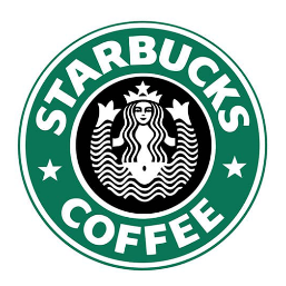
Gone are the browns and in with the greens. Howard Schultz, an investor, bought Starbucks and rebranded it. The logo turned from brown to green to signify growth and new opportunities.
The logo itself changed from being realistic into a minimalistic logo. A green circle encircled the siren with the words Starbucks Coffee. They omitted tea and spice for a better brand name.
Also, the hair of the siren now covers her breast and is colored black with stars on the ends of Starbucks to make it stand out from the competition.
1992
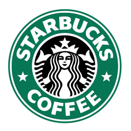
Not much has changed for the design here. However, the typography looks much sharper than in the first two. Also, the siren appears closer rather than showing the whole body. We only see a hint of the siren’s hands holding the two tails, and the navel disappears.
2008
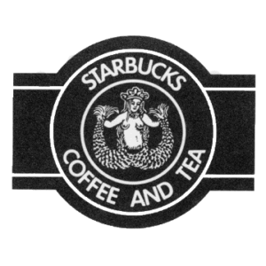
This year, we see a comeback. For the 40th anniversary of the business, Starbucks’ original logo came back with a twist. The logo was reimagined with a black design but kept the font of 1992’s logo.
Sadly, customers didn’t like the design. It was too provocative for their taste, and the market is familiar with the green, minimalist siren.
2011

We are now down to the final logo used to this day. It’s the close-up version of the siren without its wordmark. The outline is a circle while using white space to create the image of the siren.
Her face is much more symmetrical paired with its iconic green background. The design is perfect for the brand since they wanted to connect with the market better.
Let’s dissect further the depth of Starbucks’ logo. The usage of the circle signifies their universal goal and unending journey to prepare drinks for their customers.
Aside from that, the circle creates a beautiful emblem. It surrounds the siren, which pays homage to Starbucks’ town of origin. It’s a fusion of traditional and modern design.
Their logo works so well since it’s easy to layout on business cards, cups for drinks, and even social media posts. The consistency of the brand, both in print and action, aids in the overall success of their business

