A brand is more than a logo, including all the values and behaviors of a company and its employees. But, when done right, the entire value, behavior, personality, quality and product can be summed up and epitomized by the logo.
Ensuring that the logo for a luxury brand is nothing less than utterly luxurious is essential. But what is it that makes a luxury logo ooze the quality that speaks to a luxury market?
Luxury logo design must reflect style and exclusivity. There are many ways to achieve this, including selecting the right color, creating a unique and exclusive form, and ensuring that the logo is nothing short of perfection.
From haute couture to supercars, luxury logo design needs to be carefully considered. Relevance has developed logos for some of the world’s most luxurious brands. Here are six golden rules of luxury logo design.
1. Less is always more
Fast-moving consumer goods or tech brands may be more playful with their logos, often including a text description of the company within the logo or incorporating a fun drawing to represent the company or service. But for a luxury brand, these approaches are considered unluxurious.
Minimalism represents confidence in the world of luxury brand logo design. Luxury requires a refined approach where less is more. A premium brand does not require an extravagant introduction, as it works under the presumption that those in the know need no introduction. A luxury logo design should be up-to-date but should steer clear of trying to be too trendy.
As Coco Chanel said, “Fashion changes, but style endures.”
2. Black is always in style
While the products sold by a luxury brand may be full of color, as a rule, luxury brand logos are not. A luxury brand may select a brand color that becomes synonymous with the brand – think ‘Hermes orange’ and ‘Boodles pink’ – yet luxury brand logo design is often black and white or dark grey. It never clashes, and it does not detract from the product it represents because timeless style never goes out of fashion.
3. Perfect typography is luxury’s mantra
Luxury logo design has a very considered approach to typography, always with exceptional type-setting in elegant and refined fonts. The font selected may be minimalist but perfectly spaced (think Chanel) with room to breathe and clear legibility. Some luxury brands prefer a classical script alluding to their heritage and longevity (think Cartier). Others may choose a serif font used in a minimalist and fresh way (think Gucci). No matter which font is selected, it will most likely be redrawn and reconfigured to create unique letters.
4. Monogram emblems
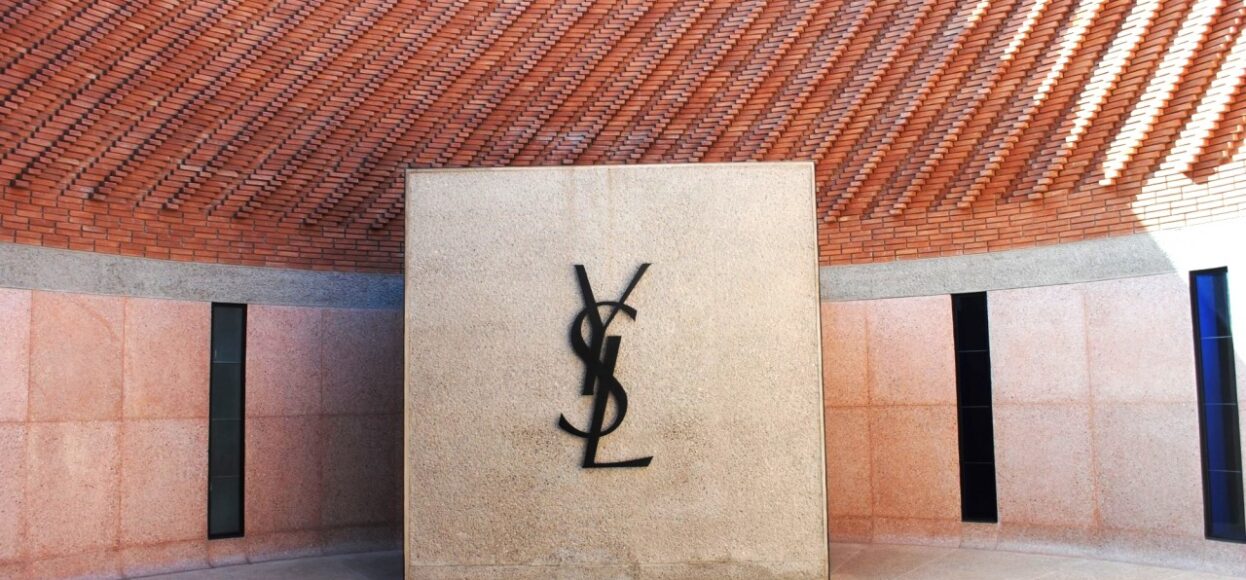
Adapting the logo is a powerful way for a luxury brand to tag its products and ensure visibility. An emblem adapted from a brand’s name is like a mini version of the primary logo. It works as a small accent, enabling anybody in the know to recognize the luxury product at a glance, even when employed in a very small space, such as ‘YSL’ placed discreetly on the side of sunglasses.
5. Luxury patterns becomes synonymous with the brand
Burberry, Louis Vuitton and Goyard are the leaders of the luxury brand pattern pack. These luxury brand patterns have become such a recognizable feature that entire lines are made with the pattern as the main act. The brand’s pattern does not require the brand name or logo to be featured.
Alternatively, the pattern may be an adaptation of the logo itself (Think Fendi with its ‘F’ pattern). This is where the brand gets to be more playful with its logo and where the fun can begin.
6. Luxury evolution
Luxury brands are often steeped in history; however, they still need to evolve to remain up-to-date.
Recent trends have seen additional debranding of luxury logo design across the board to ensure that they are adapted to work well on smaller devices. For a luxury brand, the digital age must not be allowed to cheapen the brand, and additional minimalism should be embraced in the context of luxury brand logo design. For example, Burberry has lost its night on a charging horse in favour of a new ‘B’ emblem. This emblem is used in the new Burberry pattern, while the brand’s website shows no emblem at all.


