What comes first to your mind when you hear the word “apple?”
If you ask anyone from this generation, you’ll probably get responses other than the fruit. Providing us with the latest technologies from Macbooks to AirPods and the newest iPhone 14, it’s no surprise that Apple is one of the world’s leading tech companies.
With its simple and classic logo design, Apple has created an identity that draws people in. But have you ever wondered how this iconic symbol started?
As one of the famous tech logo designs, join us as we look at the history behind the Apple logo and branding.
Apple Logo History
Apple is one of the most successful brands on the planet. With a net worth of $2417.52B, this company has more money than 186 countries worldwide.
The brand is so powerful that introducing a new product causes fans to rush to the nearest apple store to buy or reserve the latest merch. Don’t worry; we won’t judge if you do.
But it wasn’t always this way.
Apple struggled to survive the continuously evolving industry. Their success is a massive factor in their great branding – starting with their logo.
Like any other technology logo, did you know that Apple’s logo has undergone six significant evolutions in its design?
Apple Logo Evolution
When we say think of any apple products, most probably, you would think of gadgets with an Apple logo, right?
That’s how iconic the company’s logo is: their brand image immediately pops into people’s minds just by hearing the name of their company. However, before that iconic logo became widely known, let’s look at how it evolved.
- 1976
- 1977
- 1998
- 2001-2007
- 2007-2015
- 2015-Present
1976
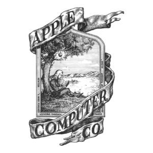
Despite representing the name Apple, the company’s first logo did not show or describe the physical shape of an apple.
Ronald Wayne, one of Apple’s co-founders, created the first logo. He wanted the company’s symbol to represent the law of gravity, inspired by the falling apple.
Its first symbol incorporated the photo of Isaac Newton, who revolutionized science by discovering gravity. Do you still remember your science lessons on how he found out about gravity?
As textbooks say, an apple fell on Sir Issac Newton’s head! This life-changing event became Apple’s first logo design, with Newton sitting under an Apple tree.
The illustration was in black and white with the words Apple Computer Co. As clever as this idea may be, it wasn’t appealing to the audience and was later changed.
1977
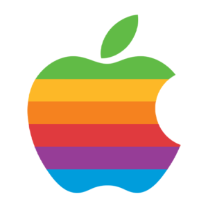
New logo evolutions consist of minimal changes or adjustments from the old one. However, when you look at this new Apple logo, there’s a massive shift in the design, not even a hint from the previous logo.
Rob Janoff made the new design and changed the monochrome palette into a rainbow logo. From a black-and-white design to a colorful one – but why?
In a Forbes interview, Janoff explained that he changed the logo to lean on simplicity. According to him, people would easily remember simple details instead of complex ones, so he transformed the symbol from a highly detailed one to a simple logo design.
1998
Forced out of the company in 1986, Steve Jobs left due to conflict with company executives. But he later returned in 1997 since the company was going to declare bankruptcy.
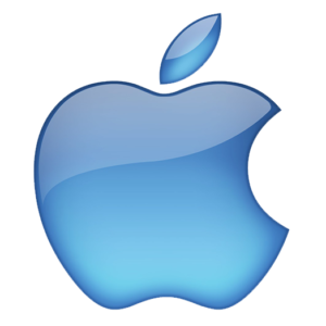
Job’s biggest challenge was revamping the company, starting with its logo. He removed the rainbow effect and used a translucent sky blue color to fit the first iMac.
However, he immediately changed it into a solid black in 1998 to complement their silver computer models and to establish Apple as a luxury brand.
2001-2007
You’d probably think that Apple has ended its logo evolution journey with the black monochrome logo, but it didn’t. As Apple became more popular, its products became more expensive as well.
So, Apple needed to rebrand itself to represent this change. The new look of Apple’s logo from 2001 until 2007 symbolized the company’s goals and aimed to transmit a sense of class, innovation, and seriousness to its audience.
Those characteristics explain why it has a more glassy look and a gradient shade.
2007-2015
Apple shifted its focus toward renewable, energy-efficient building construction. The company decided it was about time to give the brand a new look that would better reflect its branding towards renewability.
The company used the chrome version until 20015, and up until now, it’s still instilled in Apple fans that this version is one of the most sophisticated logo designs. Do you agree?
2015-Present
As the years go by, minimalistic logos using a flat design have been a worldwide trend. To keep up with the latest trends, it’s no wonder Apple changed its glassy, metallic chrome look to a flat design.
Today, Apple uses a minimal logo in three colors: white, silver, and black, depending on the medium it’s placed.
According to color psychology, black exudes power and prestige to give the brand a touch of sophistication. White reflects simplicity, minimalism, and purity, which is the perfect way to showcase Apple’s design.
Meanwhile, metallic colors like silver express prosperity and wealth, giving the logo a simple yet luxurious vibe.
Other Apple Logos
If you’re a massive fan of Apple, you already know that this company is more than just its top-quality devices. In addition to its products, it elevated its branding by offering services to its fans, such as Apple Music, Apple Watch, Apple pay, Apple TV, and many more.
The company uses different colors for these products. Join us as we take a peek at Apple’s other product logos.
Apple Music Logo
We all love listening to music; it helps us relax and process emotions. Apple introduced a treat to its customers by introducing Apple Music in 2015, a media streaming service that delivers high-quality sound.
The Apple Music logo consists of the apple, and the word Music is in San Francisco Compact typeface design on the right side. But the app has a beamed eighth note in white with a pink background.
The app’s color exudes fun and has an eye-catching color palette that is identified quickly among the many applications on a user’s phone.
Apple Tv Logo

The Apple tv logo is another example of minimalistic design, where the designers utilized a monochrome design. With the black background, the word “tv+” next to the apple logo is in bold San Francisco Compact font with clean lines and symmetry.
Also, notice that glow to the plus sign; it’s a great way to show the wonder and content a viewer would see in the database. Or the television when coming to life upon pressing that ON button. You decide the meaning.
Apple Pay Logo
With the introduction of online payments and electronic wallet service, Apple introduced its own Apple Pay system in 2014. This method allows clients to make payments through their iPhone application or web facilities without holding real cash.
The Apple Pay logo is in saturated black and white colors and exists in three versions: black apple image and the Pay is in wordmark design in pale blue and white background.
Did you know that this service is now widely used in all continents except Africa?
There you have it! What’s your favorite Apple logo version? From its first to its current design, it has evolved into a sleek and iconic style that people love today.

